fredag 16. november 2012

Instagram.. That's so 1920..


In 1923, the 19 year old and soon to be a renowned astrophysicist Carl M. Størmer had just got his hands on a detective's camera.

This was long before the first papparazzis had started to hound celebrities, and they could walk among the public with only minor intrusions from masses of fans (which usually turned them into proper assholes).

The camera he got his hands on was quite similar to the one seen on the picture below. It works by a round light-sensitive plate that could fit six round black and white photographs before the plate would need to be changed. The camera itself would be concealed underneath his vest, with the lens protruding from one of the buttonholes. The shooting sequence would be triggered by pulling a string concealed inside the trouser pocket.


Carl Størmer tells us in an interview from the 40s he explains that he would walk down the main street in Oslo and pick out his subject, this usually being some prominent figure in society, approach them and unbeknownst to them, fired off six photos at once.

At that time, photography was something that happened in some artists studio, with long exposures, so these instant-exposure cameras was something the public was generally unaware of, which allowed for very interesting pictures, and gives us a unique insight into life in the public sphere at the turn of the century in Christiania (present day Oslo).

The photographer himself. He took in total 500 self-portraits with his camera.

The most notable figures he managed to capture on film were Henrik Ibsen, Ivar Aasen, Fridtjof Nansen, Sophus Lie and Kristian Birkeland. (The latter currently on the 200 NOK note)

Ivar Aasen as an old man. The photographer recalls him looking very ill, and remembers vividly a drop suspended under his nose.


Mathematician Sophus Lie, during the march after Fridtjof Nansens return from the Fram-expedition. 


søndag 4. november 2012

COOPLANNING Series - ARCHIP

Public lectures on architecture held every thursday at ARCHIP, Kartografie Praha, Františka Křížka 1.

Free admission, everyone is welcome.


Like ARCHIP on facebook.

The House of the Future.

I am a hopeless futurist, swallowing everything whole that has to do with visions of the future like concepts for flying cars, hoverboards and cool new scientific advances that bring us ever closer to a Star Trek reality.

There is also the recurring theme of the house of the future, and one of the best in a long time if you ask me. Please check it out on ArchDaily here.

Haus der Zukunft - Dietmar Köring, Simon Takasaki, EyeTry

Norwegian Architecture in English - architecturenorway.no


A new website has just launched called "Architecture Norway".

It's based on the publications from the magazine "Arkitektur N".


There has been a lot of interest in Scandinavian, and Norwegian architecture these last years, most notably perhaps due to Snøhetta's rise to international fame, but unfortunately there has not been a lot of resources for foreigners to stay up to date on projects and discussions of architecture in Norway.


I urge you to give it a look if Scandinavian architecture is interesting to you. And please leave a comment if you are aware of other English websites on the subject.


lørdag 3. november 2012

National Technical Library, Projektil Architekti.

When others have been spending much of their lazy Saturday in bed, perhaps sleeping off the effects of alcohol from the day before (in vino veritas!) I have been at the library...

The Czech National Technical Library is a wonderful place to be, not that I did too much, it being Saturday after all, but I did look at a lot of nice big picture books.

The library was built as a consequence of a competition won by Projektil Architekti in 2000.
The construction of the building began in 2006, and finished in 2009.

The building is wonderful for a student of architecture. On the envelope of the building you can see the dimensions written directly on the facade, and all of the electrical wiring, plumbing and ventilation systems are left exposed inside. This gives us a great view into the inner workings of the building.

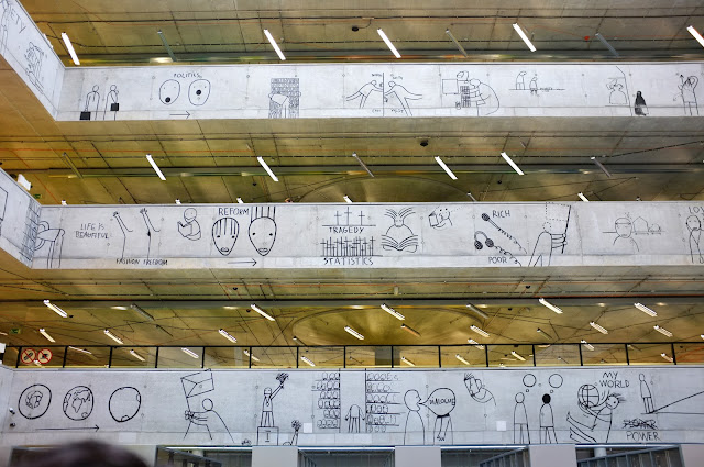
The most striking parts of the interior however is the brightly colored floor, the great illustrations on the walls (also the result of a competition, won by Dan Perjovski, and the amusing and interesting graphic design seamlessly integrated into the building (e.g how many calories you burn by walking up a flight of stairs, how long time it takes to walk up one etc.)


I will let the images say the rest.


Illustration by artist Dan Perjovski 
The colors on the floor are from a software used in architecture to measure the buildings strength, etc. The red color indicates proximity to a load-bearing wall or column.                                                                


Unfortunately, I have no image of the roof, which the architects have covered with grass and moss, in order to create a fifth facade for the taller buildings surrounding the library.

I would encourage anyone to go there when they are in Prague; admissions are free!

That little dingy on the river...


I am baptising this blog with a piece by the brilliant Samuel Beckett.


Happy saturday!